First Ideas
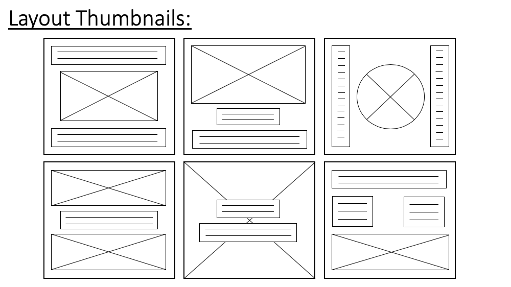
These are my layout thumbnails. They are just some ideas about how I could possibly layout my posters. The boxes with crosses in them represent images and the boxes with horizontal lines in represent text. I have tried to come up with some unique layouts as well as including some I know work well. There are some I like more than others. For example, I like the look of top left, top middle and bottom middle. These all look clean and compact. The others (especially 3), I don’t like as much as I feel it is quite unbalanced.
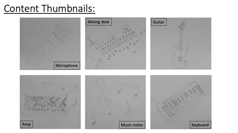
These are my content thumbnails. I have drawn images of things and themes that could feature on my posters. The first is a microphone which is a staple of all recording studios and will probably feature on at least one of my posters. This second is a mixing desk. This is also a very important asset and may feature in my posters. The guitar and amp are probably going to be a main theme of one of them as I think I can create some good images with these. The music notes could play an interesting role in my poster. I could replace one of the letters in EPIC Audio with a note for example a ‘minim’. The keyboard could be a big feature in one of my posters as it is an instantly recogniseable musical item.

Here are my first logo designs. I want a logo to be a big feature on my posters which it means that it’s important I come up with a good one. The first is plain and simple. It is just the words ‘EPIC Audio’ in bold letters. Numbers two and three was where I experimented with the music notes replacing letters. I changed the ‘I’ and the ‘A’. I preferred the look of two over three but they are both interesting concepts. I really like number four. It is simple but effective. The bold letters are punchy and grab the attention of the reader. Number eight, for me, doesn’t work. The letters mixed in, makes it confusing to read. I read it as ‘Aupico’. Nine and eleven are two of my favourites. I included a design of a sound bar on the ‘E’ in both of these desgins. I think it works well and makes the logo stand out.

Here I have continued to play with the idea of one of my logos. It is the one with the sound bar lying parallel to the ‘E’. I was experimenting with doing the bar with regular, solid lines and doing it with dashes. I prefer the look of the dashes as they are much more subtle. I don’t want it to be the focus of the logo and I felt that with the thick lines it was. I want the customer to first look at the text then be drawn to the logo. I also experimented with putting a dot on the ‘I’ however I don’t think I’ll be adding this to the final logo.

Here I have made a more final rendition of what this logo might look like. The lines are crisp and it looks clean. I like the overall look of it, however in my opinion, it looks a bit top heavy. I have put the length of the bars as 4,2,3,1 (top-bottom). I think if I switched this order (1,3,2,4) it might look a bit more balanced. I haven’t looked into colours yet, but that will be a key part in making the logo look attractive.
Fonts
Here are a collection of fonts that I liked. To find these, I used the website Dafont. They are all quite similar but they all have pros and cons.

Here is the first font I found that I liked the look of. It is called ‘Evogria’. It was on the site ‘DaFont’. It is very punchy and bold. I also made sure that the ‘E’ is big enough and able to hold the sound bars I am going to add to it.

This is the second option. It is called ‘Mont’. Again it is another in your face and bold font that really catches the eye. I’m not a huge fan of how the ‘c’ looks. I think it is a bit big but otherwise it is a solid font.

This is the third font. It is called ‘Porter’ and I like the kind of techno look it has but I think I am looking for something that is a bit bolder.

This is the fourth font I found that I liked the look of. It is named ‘Revolution’. I really like the spacing between the letters. This is the first font I will try with the logo design.