Poster construction
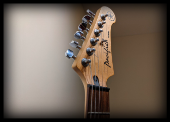
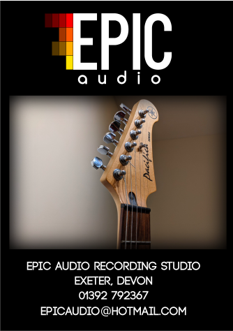
This is the first image that chose to put into a poster. It is the close up of a guitar headstock. I decided to take the sharpness out of the edges by using the blur tool.
I then added some text information that makes the poster seem more realistic. I won’t add this to all the posters but I feel this one needed it. The next and final step of this poster was to add the logo that had that had the inverted text colour.
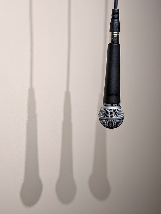
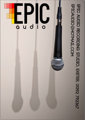
This was the second image that I decided to make into a poster. I really like the shadows on this image. There wasn’t much I needed to do in order to make an interesting poster out of it. All I needed to do was to add the logo and add the text I used on the previous poster.
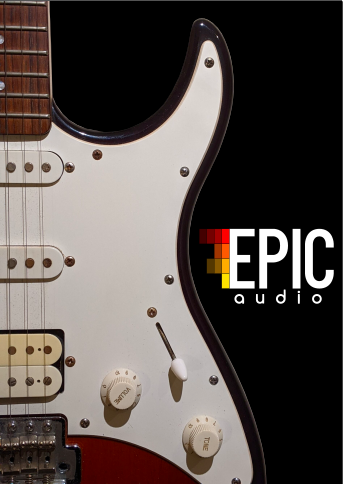
This is the third image I used. It is the side-profile of a guitar. The initial image had a lot of background that I didn’t want to include so, I traced around it using the bezier tool and then deleted the unwanted section. I also added the same black background. I then added the EPIC Audio logo. I didn’t feel like this poster needed the text on it so, this would be an internal poster. For example, it would be either inside the studio or on the door or in the reception.
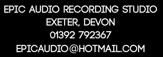
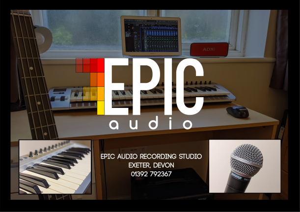
I first made a black background for me to work on. The next stage was to add a photo from my ‘home studio photoshoot’. I added it and lowered the opacity of the image so it could act as a sort of background. The black background darkened the image so the white text which can be added next will look bright and will stand out.
I then took two of my images from my previous photoshoot and gave them a black background. I then sized them, and put them either side at the bottom of the poster, with the EPIC Audio logo above it and the text between them.
Poster Prototypes
Here are my first two poster designs. There are some positives but there are also some negatives. In the first one, I like the contrast between the black and white and I like the way the logo stands out. However, the issues come with the image and text. Whilst the image is nice, it doesn’t tell the reader much about the studio and what to expect if they go. The text is also a bit bland (all capitals, one colour, size and font). I could also make the email something different and remove the word “Devon”. The second one is more interesting but still doesn’t contain enough information about what to expect and why you should go there.
These are my second two poster prototypes. The first one is an internal poster that for example would go on a door inside the studio. That is why it doesn’t have too much information on it. I decided to do a poster this way to give some diversity to my set. The second one is probably my favourite so far. It does however, once again need more information. I could use the hierarchy of importance whilst adding the info to this poster which means having the important information larger and higher than less relevant information.