Logo Designs
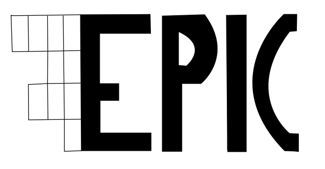
This is my first attempt at a logo. I simply took my final drawing and used the bezier tool to go around it. The reason that it is so uneven is mainly because I was adjusting to a new programme, ‘Inkscape’.
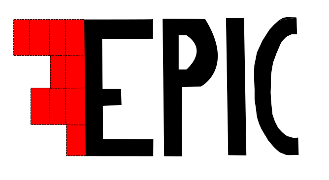
Here is my second attempt. The lettering is much better this time around. I also made it so the sound scale had dashes instead of solid lines and that it was coloured in. I couldn’t do the gradient effect with it as they were all individual lines and not individual boxes.
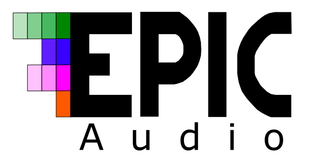
This is a more complete version of the logo. This time I used the bezier tool on one of the fonts I found in my first ideas page. It was the final one named ‘Revolution’. I also made it so the boxes were individual so I could introduce the gradient. I like this effect but I am not sure about the colours and might change them in the future.
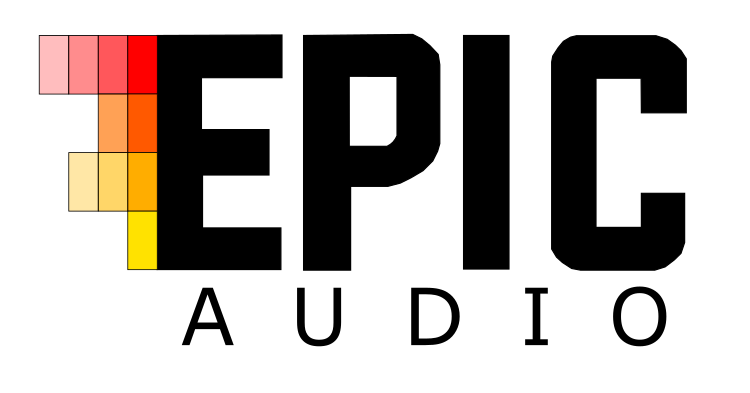
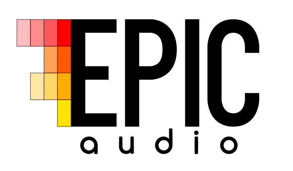
This is another logo design I made however this time, I used the Evogria font. I much prefer the colour scheme. It has a gradient both vertically (red to yellow) and horizontally (dark to light). I also prefer the ‘C’ on this version. It has more straight edges than the other font. I think I prefer this.
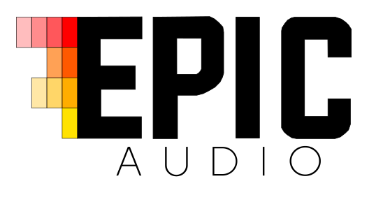
Here, I have used the same logo but this time I have used a different font for the word ‘Audio’. This time I actually downloaded the font onto my Mac instead of just taking screenshots. This gave me more freedom in terms of moving and shaping the text. I really like this font and feel like it works quite well with the main part. It is neither too bold nor too thin.
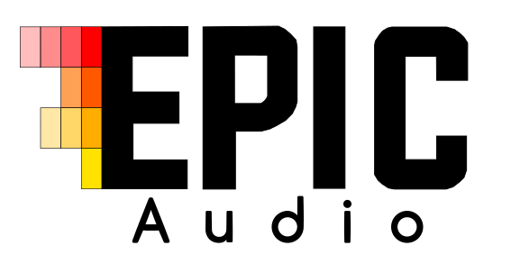
This is the second font I have experimented with. It is named ‘Code’. I don’t like this font as much. In my opinion it is too big. However it can’t be made the correct size as it goes really stretched and looks even worse than before. It is too thick in comparison to the word ‘Epic’. It takes the focus away from it.
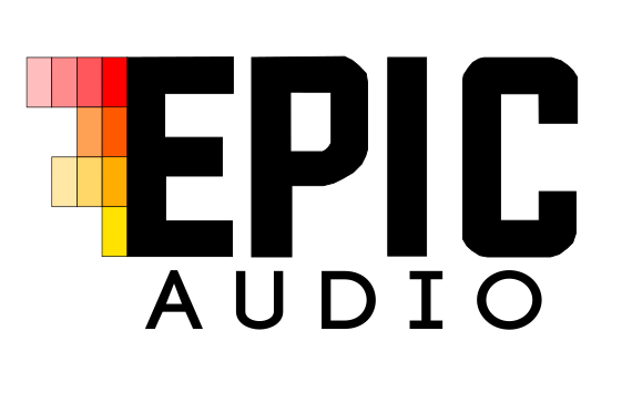
Here is the third font I have worked with. It is named ‘Biko’. Out of the three, this is my second favourite. It looks better spaced out however I think in comparison to the ‘Epic’, this font is not bold enough. I think I still prefer the first font I looked at.
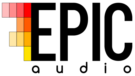
This is my final logo design. I decided that the previous font was a bit too bold and didn’t really work with the rest of the logo as a whole. I changed the main font to ‘Kenzon’ which is a bit less bold but still eye-catching. I decided to keep the same font for the word ‘Audio’ as I feel the two work well together.
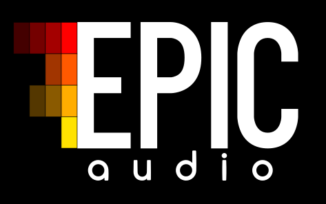
I chose to have a black background for a few of my posters which meant that I had to invert the colours of the text to make it visible.
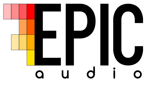
The final change I made to this logo was to adjust the spacing between the letters in ‘audio’ to make it so that they lined up with the word ‘Epic’ and so they weren’t just floating in the middle.