final Brochures


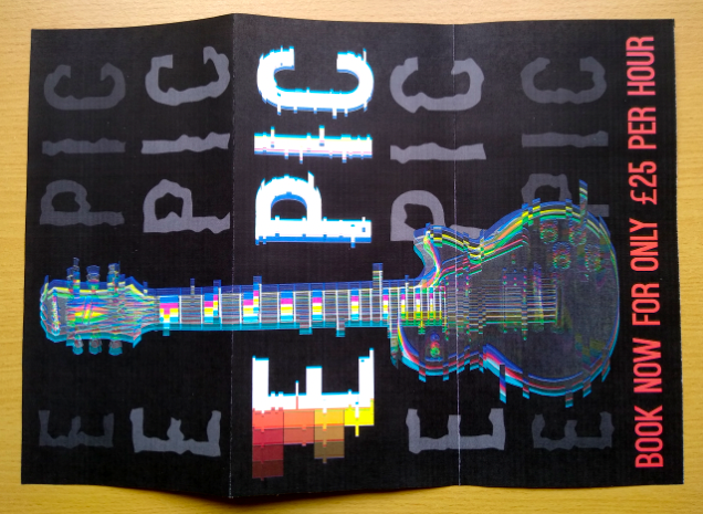
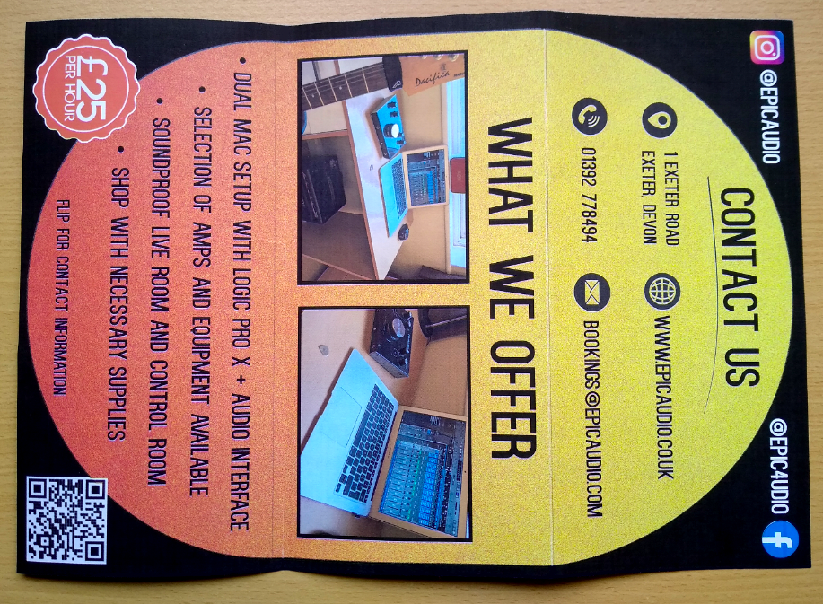
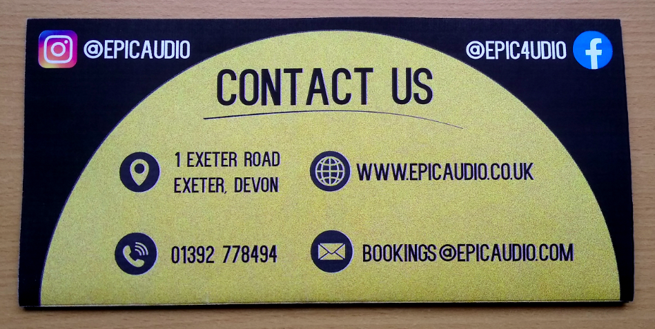
This is what my final brochure looks like after actually being made. The black of the poster looks very striking and the word EPIC stands out due to the stark colour contrast. The interior looks very eye-catching due to the range of colours and there is a good amount of information on show.
Mockups
Despite there not being any available horizontal brochure mockups, I decided to put my designs into a few regular tri-fold brochure mockups. They came out a lot better than I thought they would. I also put the poster from the back into a poster mockup.


Final project Conclusion
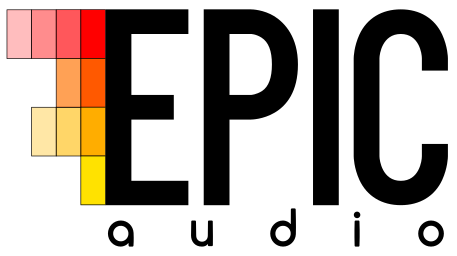
My brief for the first part of the project was for me to create a set of posters that advertised a new recording studio opening in Exeter (EPIC Audio). I created both internal and external posters for this project. I believe that there are both positives and negatives from this project. I researched and looked into my topic well. I also made an interesting logo that linked in well with the subject. However, looking back on it, the final posters aren’t as good as I would make them now I have developed some new techniques. I believe they are quite simple but they do contain a good amount of information. If I was to do this project again, I would focus on making the posters a bit more dynamic and eye-catching. If I had had access to Photoshop from the beginning, I may have been able to create a better series of designs (due to the increased capabilities of the programme compared to Inkscape which I used for all the posters).
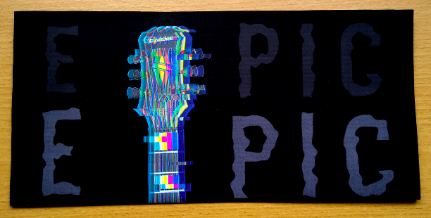
For the marketing project, I decided to create tri-fold brochure. I think this was a good route for me to go down as it would work well with the music studio idea. I think my final brochure is much more attractive than the posters. It is unique with the horizontal orientation and contains relevant information and bright colours. If I was to do this project again, I might have experimented with some more designs to see if I could have made it even better. The poster on the back of it is much better than any of my designs from the first project as it features interesting techniques such as the glitched design.
Overall, I would say that I am happy with the work I have completed within both projects. My progress can be seen as the quality of my work increases.