Brochure First Ideas
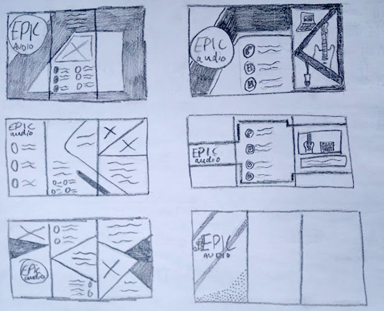
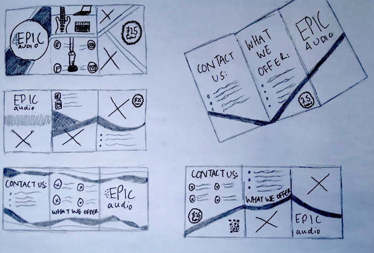
These are my very first sketches of simple designs. I have done a range of different ideas to see what I liked the look of. I have used inspiration gathered from my research such as making sure that the designs flow between the pages.
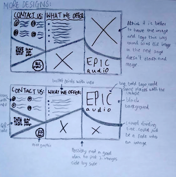
On this page, I have come up with some more designs in which the design flows between all three pages. I have also done a more 3d looking design that is a basic look at what a final one may look like.
This is my second page of ideas. I liked the shape of the line that separated the pages. On this page I was focussing on different layouts on where to put the information.
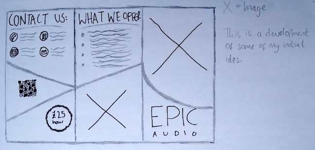
This is the first design that I thought was decent. I thought it flowed well and worked as a whole piece. I made this one into a prototype to gauge what it would look like as a 3d object. This is where I found the problems.
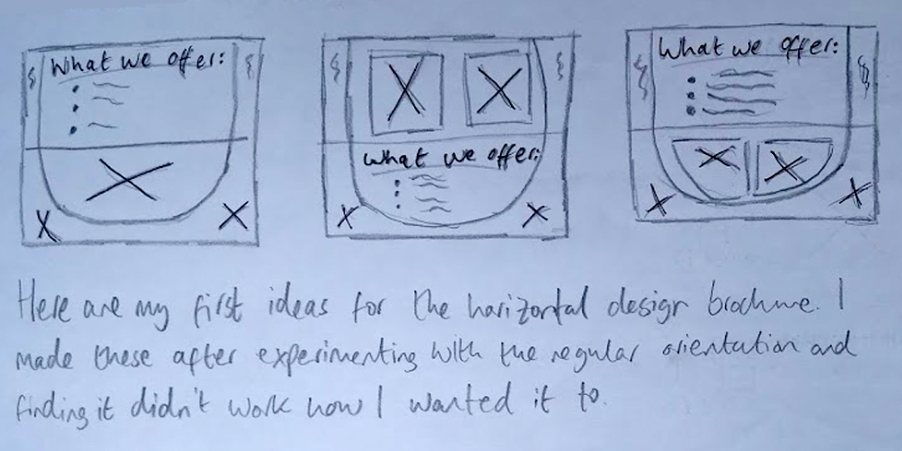
Here are my first ideas for the horizontal design brochure. I made these after experimenting with the regular orientation and finding that it didn’t work the way I wanted it to.

For this project, I decided to experiment with some new logo ideas. Here are some that I came up with. I also have put the image from Behance that they were inspired by. In the end, I decided to stick with the original design as I didn’t like how the text sat with the rest of the piece. I also thought that by giving both projects the same logo, it would tie them up nicely.
I tried both the designs with black and white backgrounds. I think I prefer the black one because it stands out much more.
This logo was sort of based on a person wearing headphones. I tried putting the wording in lots of different places but none of the locations seemed appropriate. I also tried putting it with a black background, however, this made the word ‘EPIC’ look out of place.